Discover Local Music → Find Local Shows → Create Immersive Stations. MegsRadio was an ad-free, non-profit, personalized Internet radio system. The primary goal – to promote the work of local artists by contextualizing their music with songs by well-known artists.

Customer Problem
Discovering local shows in my city or shows I might not be aware of requires a large manual effort.
Criteria
New branding, a design system based on Material Design principles across mobile and desktop, reinvent app functionality to offer a better user experience, easily fine-tune your stations, increase product and user experience fidelity.
Timeline
2013 - 2015
Role
Lead Product Designer, UX Researcher
Collaborators
Finding brand voice
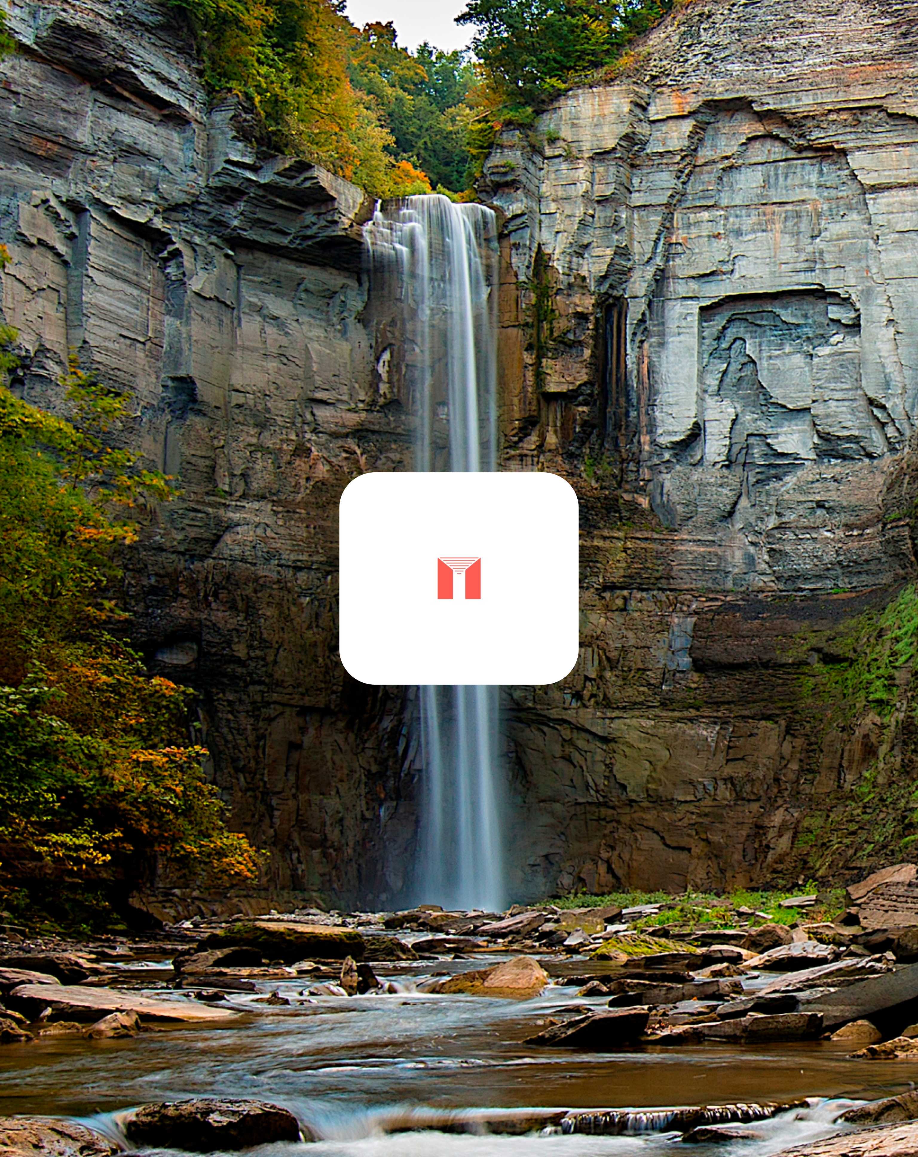
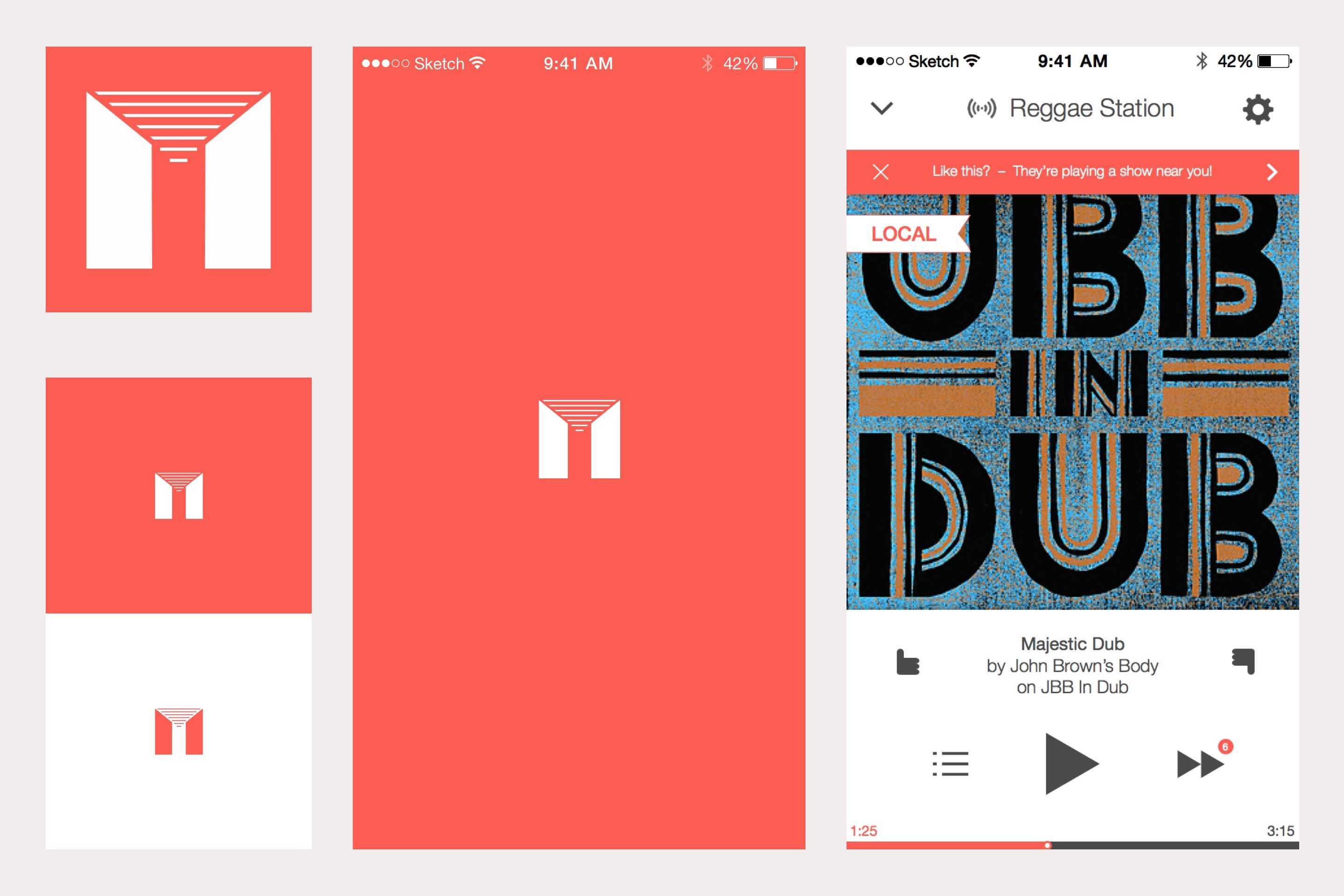
I worked directly with our founder to develop a brandmark that carried local themes through the experience. We landed on a logo that gives a nod to Taughannock Falls, a memorable local landmark. The "M" shaped logo both represents MegsRadio, a speaker, as well as the flowing water of the falls.
Setting the right tone
During the process of assessing our logo and initial branding for the app, we discussed the importance of finding a color that made us stand out amongst the most recognizable of platforms like Pandora's blue and Spotify's green. We wanted to create our own unique color choice for the MegsRadio brand that radiated homegrown and still felt like a music app.
Understanding current software
Designing for MegsRadio started with research of other music services, streaming sites, and apps. I led our cross-competitive analysis alongside our lead user researcher to clearly decipher the intent behind our competitors' solutions. We brought the entire team together for workshops of app tear-downs from Spotify, Rdio, and Pandora.
I led user tests, focus groups, and A/B testing of our own proof of concept.
Where we differed
To combat endless choice, MegsRadio suggested stations a user might be interested in. From there, users could get more creative by fine tuning their station or starting a new one altogether. When artists were playing a show near you, we directed users to purchase tickets to the upcoming event.
